
LONDON Design Awards以富含理念的小丑LITO作為獎項形象代表,其由內而外散發不依世俗的個性感,象徵設計不應按照固有框架侷限想像,而是可融合任何審美觀及概念賦予嶄新涵義,藉此鼓勵設計師們擺脫束縛、勇敢創作自己想要的作品。
The LONDON Design Awards use the clown LITO, a character rich in ideas, as the award's image. LITO exudes an unconventional personality, symbolizing that design should not be confined by fixed frameworks but can integrate any aesthetic viewpoint and concept to give it new meaning. This encourages designers to break free from constraints and bravely create the works they want.
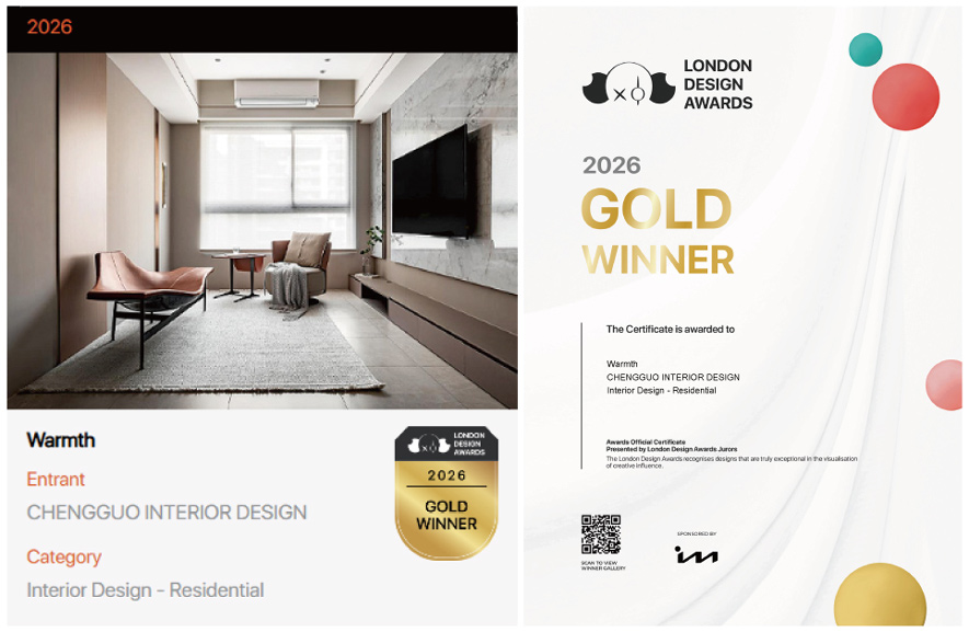
本屆大賽,洆果設計總監 劉笛榛 LIU TI CHEN 憑藉佳作《Warmth│有度之暖》於眾多競爭者中脫穎而出。本案起點源自一個涵蓋雙世代、作息節奏迥異的家庭課題──如何在維繫各自獨立空間的同時,融合整體的和諧氛圍。為此,設計團隊擘劃出「層次心法」:底層結構嚴選環保且經久耐用的建材;機能配置精準契合居者的日常動線;視覺表象更巧妙揉合石紋、原木及金屬,令冷冽與溫潤的調性在日光下流轉共生。客餐廳則定調中性色系,各自的寢室則依個人偏好揉入繽紛基調,彼此邊界清晰卻不顯突兀。
n this competition, Design Director Liu Ti Chen of CHENG﹣GUO DESIGN stood out from numerous competitors with his masterpiece, "Warmth." The project originated from a family spanning two generations with vastly different lifestyles—how to maintain individual personal spaces while seamlessly integrating a harmonious overall atmosphere. To address this, the design team devised a "layered approach": the ground floor structure utilizes environmentally friendly and durable building materials; functional configurations precisely match the residents' daily flow; and the visual presentation cleverly blends stone textures, natural wood, and metal, allowing cool and warm tones to coexist and flow under sunlight. The living and dining areas are set in a neutral color scheme, while each bedroom incorporates a vibrant palette based on individual preferences, creating clear boundaries without appearing jarring.
相較於流於表面的視覺堆疊和過度雕琢,這件獲獎傑作更聚焦於場域如何承載兩代人日常步調的差異──伴隨入住時間的拉長,愈能察覺設計師在分寸拿捏上的用心,亦能窺見洆果設計長期在材質工藝、實用機能及空間比例間悉心鑽研的底蘊。全案因應生活本質而生、不拘泥於特定風格,恰恰呼應小丑LITO所傳遞不受侷限的創作精神;而這項國際殊榮,不僅是對團隊專注初心的實質嘉許,更標誌著品牌邁向國際的全新里程碑。
Rather than superficial visual layering and excessive embellishment, this award-winning masterpiece focuses on how the space accommodates the differences in the daily pace of two generations. As the stay extends, the designer's meticulous attention to detail becomes increasingly apparent, revealing the depth of LITO Design's long-standing expertise in material craftsmanship, practical functionality, and spatial proportions. Born from the essence of life and not confined to any particular style, the entire project perfectly echoes the unrestricted creative spirit conveyed by LITO. This international honor is not only a substantial recognition of the team's dedication to their original aspirations but also marks a new milestone in the brand's international expansion.
金獎作品《Warmth│有度之暖》
Gold Award-winning work "Warmth"
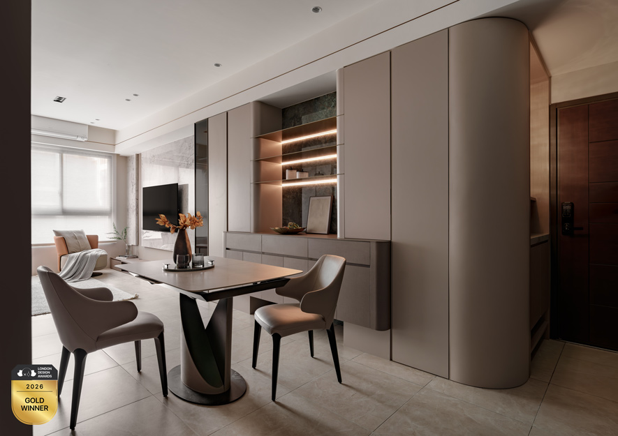
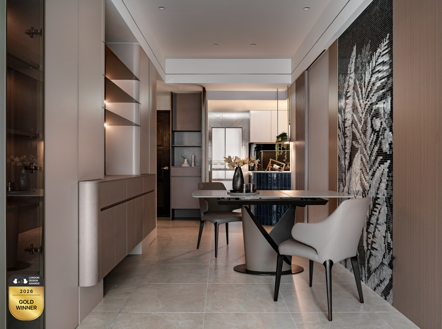
餐廳順應餐桌時有挪移使用的需求,鄰近牆面選用耐髒汙易清潔的馬賽克藝術磚,一旁餐邊櫃則以弧形收邊柔化量體銳角,內部線燈點亮底牆石紋及層板金屬反射細節,營造輕盈懸浮的觀感效果,織就細緻展示氛圍。
To accommodate the occasional need for tables to be moved, the restaurant features stain-resistant and easy-to-clean mosaic tiles on the adjacent walls. The sideboard next to it has rounded edges to soften its sharp angles, and internal linear lights illuminate the stone texture on the base wall and the metallic reflections on the shelves, creating a light and floating visual effect and weaving a refined display atmosphere.
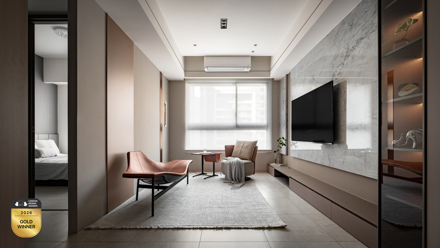
客廳電視牆藉由淡色石材的左右陳貼配合牆面雙層設計,鋪敘質材向外延展的放大感受,輔搭下方銜接餐邊櫃的同色電視櫃,進一步蔓延色彩連續的水平軸線,使整體畫面更顯整潔開闊。
The living room TV wall uses light-colored stone to cover the left and right sides, combined with the double-layer design of the wall, to create a sense of expansion as the material extends outwards. It is complemented by a TV cabinet of the same color that connects to the sideboard below, which further extends the horizontal axis of color continuity, making the overall picture more clean and open.
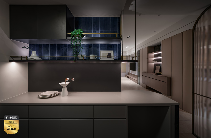
表層拼貼深藍窯變磚的弧形中島柔潤傳統硬性的直線邊界,塑造廚房與客餐廳間的流暢過渡區;且溫暖的手作質地磚面延續至場域壁面高處,佐以前方俐落金屬層架,圍塑「暖而不膩、簡而不冷」的絕美冷暖對比。
The curved island, with its surface layer of deep blue kiln-fired bricks, softens the traditional hard straight lines, creating a smooth transition zone between the kitchen and the living and dining areas. The warm, handcrafted brick surface extends to the upper part of the walls, complemented by sleek metal shelves in front, creating a beautiful contrast between warm and cool tones that is "warm but not cloying, simple but not cold."